When designing an interior space, choosing the right tile color is one of the most important decisions you can make. The color of your ceramic tile or porcelain tile not only sets the tone of the room but also affects how large, bright, and comfortable it feels. This guide will help you understand how to select tile colors that match your style, lighting, and room function.
1. Understand the Effect of Tile Color
▪ Light vs. Dark Tiles
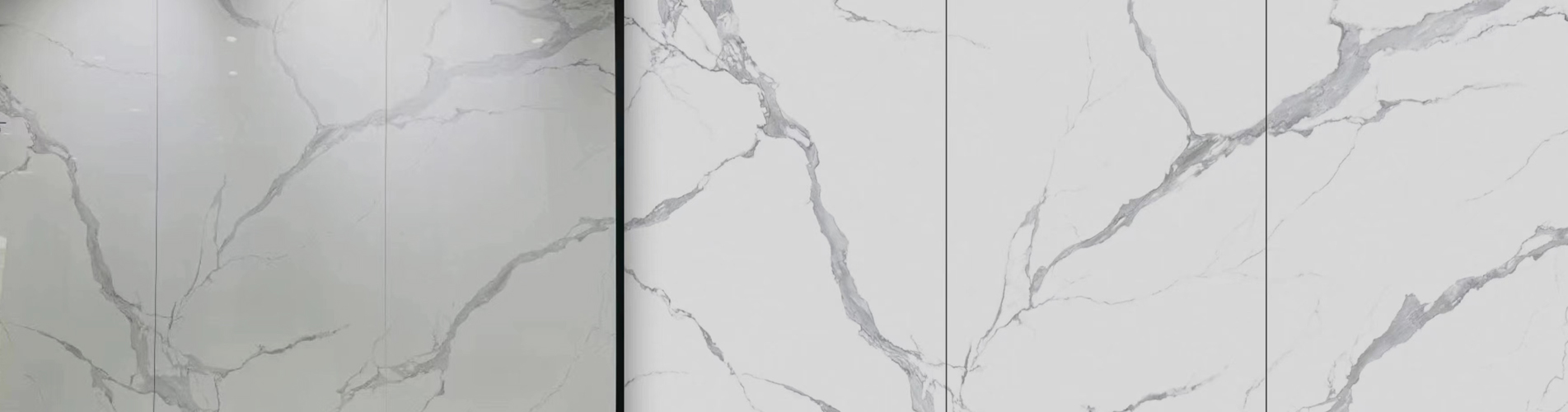
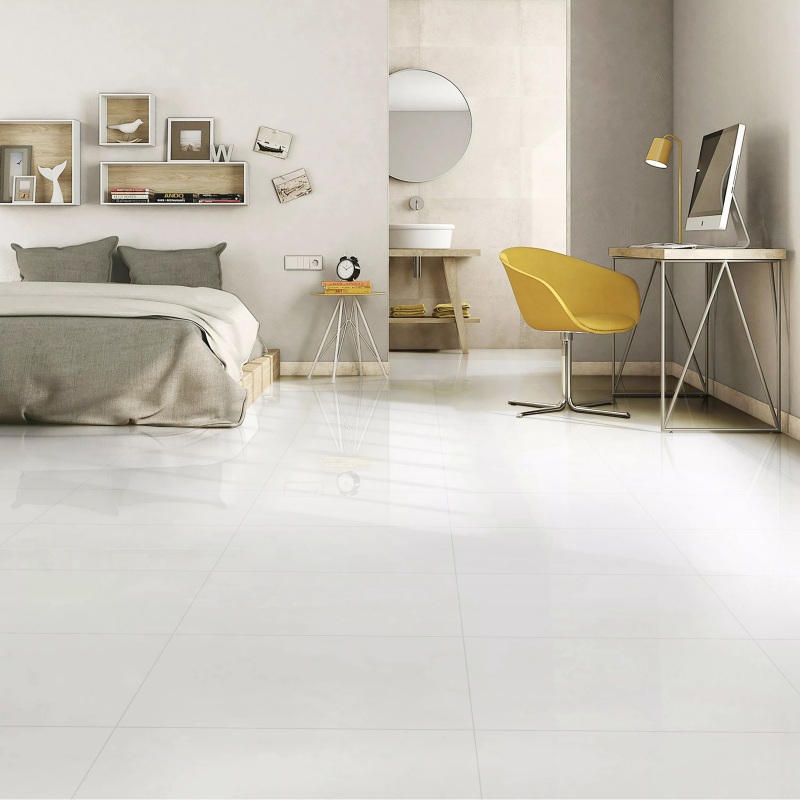
Light-colored tiles, such as white tiles, cream tiles, and light grey porcelain tiles, make a room appear larger and more open. They reflect more light, giving a bright and clean feeling — ideal for small apartments or rooms with limited sunlight.Dark tiles, like charcoal, navy, or black floor tiles, create a luxurious and dramatic atmosphere but can make a small space feel smaller. They are best used in larger areas or as accent walls.
▪ Warm and Cool Tones
Every tile color has an undertone.
Warm tones (beige, tan, terracotta) add coziness and pair beautifully with wood furniture and gold hardware.
Cool tones (grey, blue, green) bring a calm, modern feel and match well with metal or glass accents.Choosing the right undertone ensures harmony between your tile flooring and interior decor.
2. Match Tile Color to Room Function
▪ Living Room and Hallway
Neutral colors such as light beige floor tiles or stone-look porcelain tiles create a welcoming and timeless feel. Large-format tiles (like 600x1200mm porcelain tiles) minimize grout lines, offering a seamless and modern look.
▪ Kitchen and Dining Area
Kitchens benefit from mid-tone or patterned tiles that hide stains easily. Pair neutral ceramic tiles on the floor with colorful backsplash tiles in blue, green, or mosaic styles for visual interest.
▪ Bathroom and Wet Areas
Bathrooms look brighter with white, aqua, or light grey tiles. For a luxury effect, try marble-look porcelain tiles or matte finish tiles that reduce glare and provide slip resistance.
▪ Bedroom and Study
For a relaxing vibe, choose soft and warm tones — sand, taupe, or muted terracotta tiles. These create comfort while maintaining elegance.
3. Consider Lighting and Room Size
Lighting changes how tile color looks:
North-facing rooms get cooler light — use warm tiles like beige or ivory.
South-facing rooms get warmer sunlight — use cool tiles like grey or white marble tiles to balance.Always test samples under your actual lighting before buying.
4. Popular Tile Color Trends (2025)
Recent Google search trends show that homeowners are gravitating toward:
Neutral and natural hues – beige, cream, stone grey
Earthy and organic tones – terracotta, olive green, sand
Modern contrasts – white with black grout or dark accents
Textured tiles – stone-look and wood-look porcelain tiles that bring natural character indoors
These styles dominate floor tile trends and wall tile designs worldwide.
5. Expert Tips Before Finalizing
Always check your tile sample under both daylight and artificial light.
Match your grout color with the tile for a more unified look.
Combine neutral tiles with a bold accent wall to add personality.
Consider maintenance — darker tiles show dust and soap stains more easily.
Keep resale value in mind: neutral tones appeal to most buyers.
6. Summary
Choosing the perfect indoor tile color is about balance — between light and dark, warm and cool, subtle and bold. Whether you prefer ceramic tiles for traditional beauty or porcelain tiles for durability, color plays a key role in defining the atmosphere of your home. By understanding tone, lighting, and trending designs, you can create a space that is both stylish and timeless.
 How to Choose the Indoor Tile Colors


 IPv6 network supported